Wall sconces are among the most practical yet influential lighting elements in interior design. Contrary to popular belief, these lights are not merely auxiliary sources of illumination; they can transform the mood of a room, highlight wall architecture, or even serve as a focal point of a space. However, many people make mistakes when purchasing or installing wall sconces, resulting in reduced aesthetic appeal, inefficient lighting, or extra costs for repairs and replacements.
In residential projects and even luxurious spaces such as hotels, restaurants, and villas, incorrect wall sconce installation can cause inappropriate shadows, glare, insufficient illumination, or disrupt the visual harmony of the wall. Choosing an unsuitable model—without considering material, beam angle, light intensity, or compatibility with the interior style—can negatively affect both the aesthetics and functionality of the space.
This article examines ten common mistakes in purchasing and installing wall sconces and provides practical solutions to help you make the best choice for your space and avoid common issues. If your goal is to elevate your home décor, achieve professional wall lighting, or make a confident purchase, this guide can make a significant difference in the final outcome.
Mistake 1: Choosing a Wall Sconce Without Considering the Type of Space
One of the most common mistakes when buying a wall sconce is selecting a model solely based on appearance, without considering the actual needs of the space. Each area of the home—from bedrooms to hallways and bathrooms—requires different levels of illumination, beam angles, and even materials. If a wall sconce is not appropriate for the space, it will neither function effectively nor enhance the décor.
For example, a sconce purchased for the living room might produce excessive light in a bedroom, causing glare. Or a sconce with a beautiful design but insufficient IP rating may quickly fail in a bathroom, posing safety risks. Therefore, the first step in making an appropriate purchase is understanding the space and its lighting requirements.
1. The Role of Space in Determining Light Intensity (Lumens)
The suitable light intensity varies for different spaces:
-
Bedroom: requires soft, warm, and calming light.
-
Living Room: needs sufficient light to complement ceiling illumination.
-
Hallways and Staircases: require moderate light intensity with controlled beam angles.
-
Bathrooms: need clear, bright light without harsh shadows.
Excessive brightness can make a space feel cold and clinical, while insufficient light turns the sconce into a decorative object without functional impact.
2. Pay Attention to Color Temperature (CCT) Suitable for the Space
Color temperature is a critical factor affecting the mood of the room:
-
Bedroom: 2700–3000K
-
Living Room: 3000–3500K
-
Hallways and public areas: 3000–4000K
-
Work or study areas: 4000–5000K
Incorrect color temperature can cause:
-
Too white: cold, lifeless atmosphere
-
Too yellow: dull wall colors and reduced visual quality
Before buying, determine the purpose of the light: relaxation, visual appeal, or practical illumination.
3. Importance of Beam Angle According to Space Usage
The beam angle determines how light spreads across the wall.
-
Downlight: suitable for hallways, entrances, and stairs
-
Uplight: ideal for living rooms and decorative points
-
Two-way: best for creating harmony in living areas
-
Wall washer: ideal for textured, stone, or artistic walls
Ignoring the beam angle can create unwanted shadows, obscure wall details, cause eye discomfort, and disrupt functionality.
4. Matching the Sconce Size with the Space
Choosing a sconce too large for a small room or too small for a large room is a common mistake.
-
Large, intricate sconces in a small bedroom overwhelm the visual space.
-
Small sconces in a spacious living room become almost invisible and fail to impact lighting.
The size of the sconce should align with ceiling height, wall width, and ambient light.
5. Choosing the Wrong Material for the Space
Not all materials suit all environments:
-
Wood: warm and attractive but unsuitable for humid areas.
-
Brass or stainless steel: durable and luxurious.
-
Frosted glass: soft light for bedrooms.
-
Aluminum with high IP rating: best for bathrooms and balconies.
Wrong material choices can lead to rust, color changes, cracking, and reduced lifespan.
Practical Solution: Ask yourself five questions before buying:
-
Which area of the home will this sconce be installed?
-
Do I need strong, soft, or decorative light?
-
What is the suitable color temperature for this space?
-
Does the beam angle match the space’s function?
-
Is the material compatible with the environment?
If these questions are unanswered, you may pick a visually appealing sconce with poor performance.
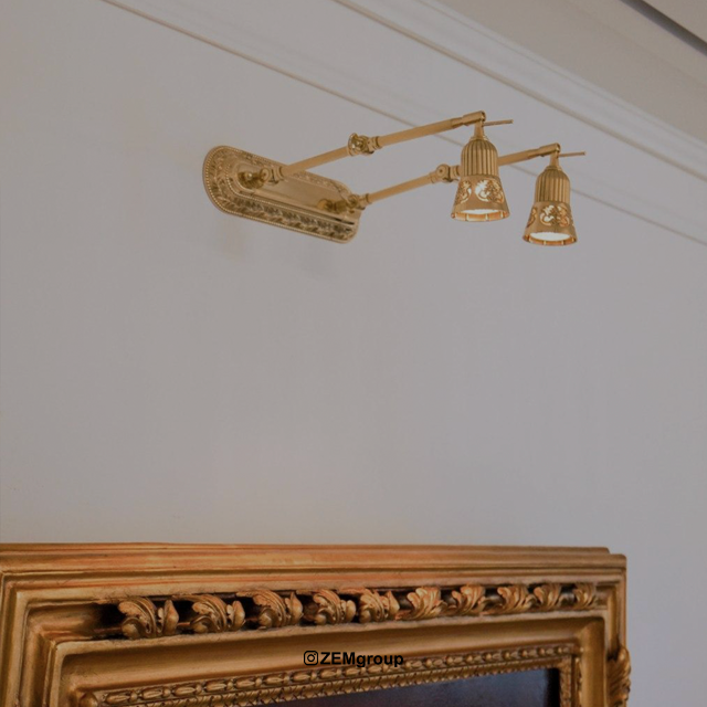
Mistake 2: Installing a Wall Sconce at the Wrong Height
Choosing the right sconce is only half the task; proper, standard installation is equally important. One common problem is installing wall sconces at incorrect heights, which can reduce both aesthetic appeal and functional effectiveness.
Height should not be considered a fixed number; it depends on ceiling height, space type, sconce model, and lighting purpose. However, there is a standard range that usually ensures optimal visual impact.
1. Installing Too Low Causing Glare
Low installation places the light source directly in the viewer’s line of sight, causing glare and discomfort.
Causes of glare:
-
Direct line of sight to the light source
-
High lumen output at close distance
-
Reflection from glossy surfaces
-
Lack of a proper diffuser
Common locations: hallways, beside beds, tall-walled rooms, or areas with heavy foot traffic using two-way sconces.
Solution: Typically, install sconces 150–170 cm from the floor to prevent glare while still illuminating the space adequately.
2. Installing Too High Reduces Light Impact
Overly high placement, especially in rooms with high ceilings, can:
-
Direct light toward the ceiling instead of walls
-
Leave the lower wall dark
-
Render the sconce ineffective
-
Create undesirable shadows
-
Disrupt interior balance
Tip: For ceilings over 3 meters, height can be increased to 170–180 cm but never higher.
3. Misalignment with Furniture
Sconces should align with furniture lines. Incorrect height relative to beds, consoles, sofas, or mirrors can create visual clutter, asymmetric lighting, and improperly placed focal points.
Example: Sconces beside beds should be 120–140 cm in height for seated use. Higher placement causes discomfort.
4. Asymmetric Installation Along the Wall
In living rooms or hallways, multiple sconces in a line must have equal height and spacing. Misalignment disrupts visual order, balance, and architectural aesthetics.
Solution: Use laser lines or plumb lines and measure spacing (usually 120–180 cm apart).
5. Ignoring Sconce Model When Determining Height
The ideal height depends on the sconce type:
-
Uplight: slightly lower to spread light effectively
-
Downlight: slightly higher or at eye level depending on use
-
Two-way: centered in the line of sight
-
Wall washer: usually installed at 130–150 cm depending on beam angle
Incorrect height can destroy the lighting pattern.
6. Global Standard Heights
| Space Type | Recommended Height from Floor |
|---|---|
| Hallway & Entrance | 150–170 cm |
| Living Room | 160–170 cm |
| Bedroom (beside bed) | 120–140 cm |
| Bathroom | 150–160 cm |
| Feature Wall / Tall Walls | 165–180 cm |
| Ceilings over 3 m | 170–180 cm |
Proper installation height significantly affects lighting quality, décor, and visual comfort.
Mistake 3: Choosing the Wrong Light Source
Many focus only on the sconce appearance, ignoring the type of bulb. Wrong bulbs can alter light quality, increase energy consumption, reduce lifespan, create unwanted shadows, generate heat, or damage the fixture.
1. Using Old or High-Consumption Bulbs
-
Incandescent: high heat, high energy use, short lifespan, color changes in wooden or fabric sconces.
-
CFL: slow start, cold glare, poor decorative quality, moisture sensitivity.
Not recommended for luxury or modern interiors.
2. Choosing Incorrect Light Intensity (Lumens)
High intensity: glare, harsh shadows, disturbed calm.
Low intensity: insufficient light, reduced decorative effect.
Standard lumens for wall sconces:
-
Hallway: 300–500 lm
-
Living Room: 400–700 lm
-
Bedroom: 200–400 lm
-
Beside Bed: 150–300 lm
-
Bathroom: 500–800 lm depending on IP rating
3. Ignoring Appropriate Color Temperature (CCT)
Wrong color temperature alters mood and clashes with interior style:
-
Bedroom: 2700–3000K
-
Living Room: 3000–3500K
-
Hallway: 3000–4000K
-
Bathroom: 4000–5000K
-
Decorative: 2700K
4. Low CRI Bulbs
Low CRI distorts true colors, especially on walls, mirrors, and materials like wood, stone, or fabric. Use minimum CRI 80 for public areas, 90+ for luxury spaces.
5. Wrong or Incompatible Bulb Base
Common bases: E14, E27, GU10, G9. Incompatible bulbs reduce lifespan, increase heat, and lower output.
6. Low-Quality, Cheap Bulbs
-
Flicker
-
High heat
-
Low CRI
-
Short lifespan
-
Gradually dim over time
-
Damage internal circuits
7. Ignoring Energy Efficiency
Always check for: energy class A/A+, high efficiency, low heat, long lifespan.
Key Takeaways: Use high-quality LED bulbs, appropriate lumens, correct CCT, proper CRI, compatible bases, and avoid low-quality or outdated options.
Mistake 4: Ignoring Color Temperature (Kelvin) and Choosing Incorrectly
Color temperature determines the emotional effect of the light: warm and cozy, neutral and balanced, or cold and formal. Incorrect Kelvin can cause fatigue, reduce comfort, or distort décor.
-
Too cold (>4000K): sterile, tiring
-
Too warm (<2700K): overly yellow, dark, or aged appearance
-
Balanced (3000–3500K): natural, calming, and suitable for most interiors
Impact on décor: Affects wall textures, colors, and decorative elements. Proper selection enhances natural textures, architectural lines, and decorative frames.
Common mistakes: People often select sconces randomly without checking Kelvin, relying only on appearance or store staff.
Recommended color temperatures:
-
Bedroom: 2700–3000K
-
Living Room: 3000–3500K
-
Hallways: 3000–3500K
-
Bathroom: 3500–4000K
-
Commercial/Gallery spaces: 3000–4000K depending on focus
Prevention: Check packaging, test in-store, align with main space lighting, and consider dimmable sconces for variable spaces.
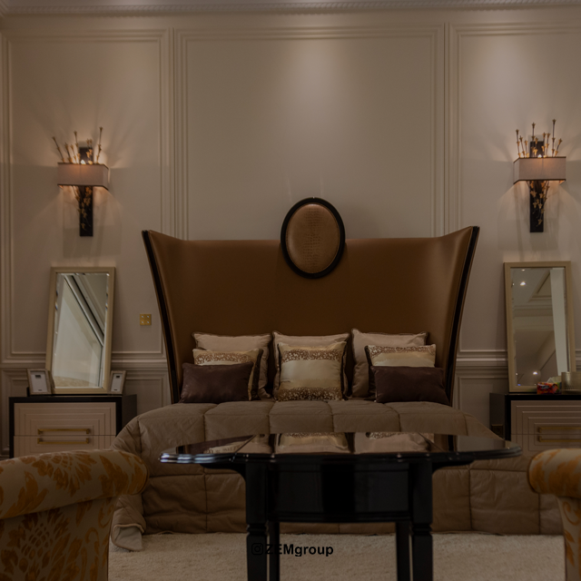
Mistake 5: Installing at the Wrong Height and Disrupting Visual Balance
Improper height can ruin a sconce’s aesthetics and functionality. Wall sconces are at eye level; even small mistakes can create glare, uneven shadows, or unbalanced walls.
Guidelines:
-
Standard height: 150–170 cm from floor for most residential and luxury projects
-
Hallways: 165–170 cm
-
Beside beds: 110–130 cm
-
Living room / TV wall: 150–160 cm
-
Bathroom mirrors: ~160 cm or aligned with mirror center
Common errors: uniform height regardless of model, ignoring furniture, no interior designer input, visual asymmetry.
Solutions: Test before drilling, consider user height, align with furniture, align with decorative frames, involve a lighting designer for luxury spaces.
Mistake 6: Incorrect Light Intensity (Lumens) Causing Glare, Shadows, or Insufficient Illumination
Many focus on wattage, but lumen output is what matters. Incorrect intensity results in overly bright or too dim lighting, creating glare, sharp shadows, or imbalance.
Why lumens matter:
-
Wall sconces have decorative and functional roles.
-
Wrong intensity: unattractive walls, unprofessional lighting, uneven brightness, eye fatigue, disturbing nighttime glare.
Watts vs. Lumens:
-
Watt measures energy consumption.
-
Lumen measures actual light output.
Example: 7W SMD = 800 lumens, 12W COB = 600 lumens. Always select by lumens.
Recommended lumens:
-
Hallways: 400–700 lm
-
Living room: 300–500 lm
-
Bedroom (beside bed): 200–350 lm
-
Bathroom mirror: 500–900 lm
-
TV wall: 200–300 lm
-
Luxury spaces: 300–600 lm depending on ceiling height
Common mistakes: Using extremely bright or dim sconces, or mixing different intensities on one wall.
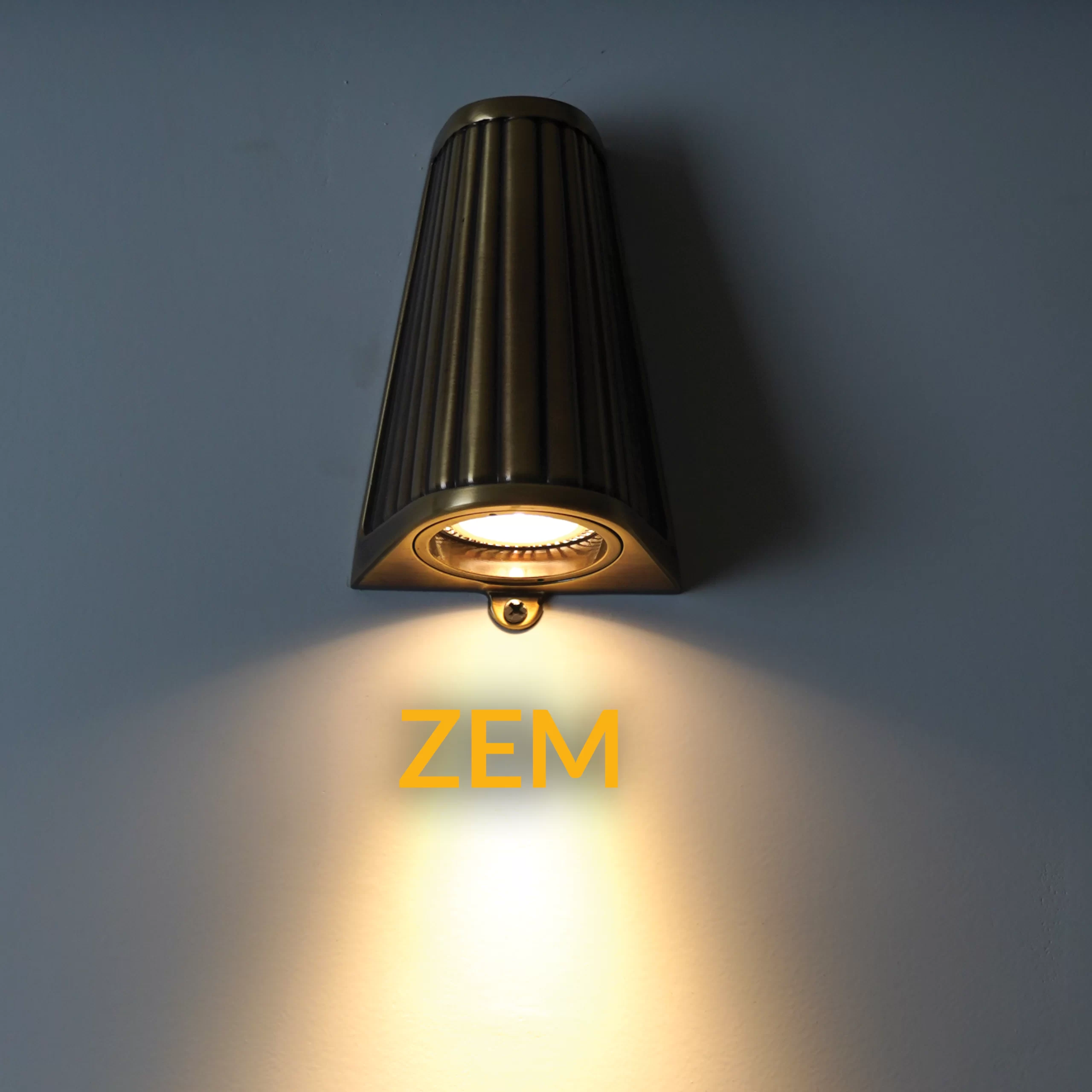
Mistake Seven: Choosing the Wrong Light Distribution Type (Up, Down, Up & Down, Diffused, Spot) and Wasting the Aesthetic of Wall Sconces
One of the most critical factors often overlooked by buyers is the type of light distribution of the wall sconce. How the light is directed, its intensity, and pattern determine:
-
How the wall appears
-
The mood of the interior space
-
How much the architecture and texture of the wall are highlighted or subdued
-
Whether the space looks brighter or darker
-
Which areas the light focuses on
Selecting the wrong light distribution type can make even a beautiful, expensive wall sconce look ineffective, irritating, or mismatched with the décor. Below, we introduce the types of light distribution and common mistakes for each.
Why Light Distribution Matters for Wall Sconces
Unlike chandeliers, spotlights, or ceiling lights, wall sconces usually serve an accent or emotional role. They are less about illuminating the entire space and more about shaping the ambiance, shadows, halo effects, and wall textures.
If the wrong light distribution is chosen:
-
The wall may appear inconsistent
-
Light may be overly concentrated and harsh or too dispersed and ineffective
-
Architectural lines and moldings may not be highlighted properly
-
The space may be visually unbalanced
-
Bright and dark spots may create a scattered or cluttered feeling
-
Unpleasant shadows may appear on walls or even faces
Summary:
The light distribution type determines the character of the wall sconce in a space.
Types of Light Distribution and Their Uses
-
Up Light
Light is directed 100% upwards.
Uses:
-
Makes the ceiling appear higher
-
Creates a soft halo on the wall
-
Accentuates tall ceilings, moldings, or curtains
-
Suitable for calm spaces like living rooms, bedrooms, and lobbies
Common mistake: Choosing this type for low walls or very small spaces. Result: the ceiling feels heavy and the wall appears cramped.
-
Down Light
Light is directed downward only.
Uses:
-
Illuminates pathways
-
Highlights objects (console tables, side tables, artwork)
-
Creates pleasing shadows on textured walls
Common mistake: Installing on walls with rough surfaces (stone or concrete). Strong downward light creates harsh and unpleasant shadows.
-
Up & Down Light
The most popular wall sconce type in modern and luxury interiors.
Uses:
-
Creates two beautiful cones of light
-
Enhances the vertical architecture of the wall
-
Illuminates both top and bottom simultaneously
-
Suitable for living rooms, hallways, beside TVs, and staircases
Common mistake: Choosing fixtures with very sharp light angles that create harsh shadows and annoying light lines. In small spaces, strong Up & Down lights can cause visual clutter.
-
Diffused Light
Light passes through frosted glass, acrylic, or a lampshade and spreads evenly.
Uses:
-
Bedrooms
-
Beside mirrors
-
Calm and minimal spaces
-
Soft, hotel-like décor
Common mistake: Using fully diffused lights in hallways or pathways where directional light is needed to guide movement.
-
Spot Light
Light is concentrated on a specific point.
Uses:
-
Artwork
-
Sculptures
-
3D walls
-
Highlighting a particular point (focus light)
Common mistake: Using spotlights as general lighting or installing them at eye level. Result: severe glare.
Common Mistakes in Choosing Light Distribution
-
Using Up & Down for every type of wall — textured walls may produce unwanted shadows.
-
Excessive diffused light on walls with moldings or wall panels — details get lost.
-
Spotlights in small spaces — creates unnatural focus and makes the room feel smaller.
-
Ignoring light reflection from furniture — downward light can reflect unpleasantly off glass or glossy surfaces.
-
Using Up-only lights on low ceilings — results in a heavy and cramped feeling.
How to Choose the Right Light Distribution
Consider these factors:
-
Wall type:
-
Textured → soft diffused light
-
Smooth → Up & Down or Spot works well
-
-
Ceiling height:
-
High → Up or Up & Down
-
Low → Diffused or Down
-
-
Space function:
-
Calm areas → diffused and soft light
-
Movement areas → directional light
-
Art spaces → Spot
-
-
Decor style:
-
Modern → Up & Down or linear lights
-
Classic → diffused or glass lights
-
Minimal → fully hidden, soft lighting
-
-
Lighting goal:
-
Highlight a wall, illuminate a pathway, or emphasize a specific object?
-
Professional tips to avoid mistakes:
-
Test the light distribution in-store before purchasing.
-
If possible, try the light on the home wall before installation.
-
Avoid excessive diffused light behind TVs.
-
In bedrooms, diffused light works better than Up & Down.
-
In hallways, Down or Up & Down is ideal.
-
In luxury spaces, combining multiple distribution types creates exceptional visual depth.
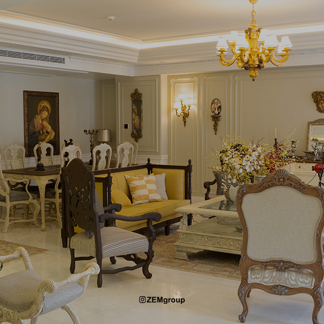
Mistake Eight: Ignoring Material and Color of the Wall Sconce
A major mistake affecting aesthetics and harmony is neglecting the material and color of the wall sconce. Many people focus only on the design and assume “as long as it looks good, it’s fine,” while material and color play a decisive role in coordinating with décor, light reflection, and the luxury feel of a space.
Wall sconces are installed close to eye level, unlike ceiling or chandelier lights, so even minor mismatches in color or material can disturb the eye or affect the perception of the space.
Why Material and Color Matter
Wall sconces combine beauty and function:
-
Body material:
-
Brass, aluminum, steel, glass, acrylic — each has a different visual weight and finish.
-
Poor-quality material can reflect light undesirably, cause eye strain, or reduce light quality.
-
Dark metal on a light wall → luxurious and minimal effect
-
Frosted glass → soft, diffused light, ideal for bedrooms
-
-
Color:
-
Gold, bronze, or black → luxurious, classic feel
-
White or silver → modern, minimal
-
Clashing colors → disharmony
-
Glossy → strong reflections and glare
-
Matte → soft, gentle light
-
Common mistakes:
-
Glossy metal in bedrooms → glare when lying down, harsh wall reflections
-
Color mismatch with walls → light-colored sconce on light wall → disappears; dark on dark → low contrast
-
Cheap glass or crystal → uneven light, short lifespan, quick staining
-
Ignoring harmony with other materials → e.g., shiny metal near matte wooden furniture
Impact of Material and Color on Light and Décor
-
Material affects light intensity and quality:
-
Matte metals → soft, controlled light
-
Glossy metals → multiple reflections
-
Frosted glass → uniform, gentle light
-
Clear glass → sharp, directional light
-
-
Color affects space perception:
-
Warm → cozy feeling
-
Cool → formal or industrial
-
-
Combining sconce color with wall, furniture, and flooring creates full visual harmony
Tips to avoid mistakes:
-
Match material with décor style:
-
Classic → brass, bronze, crystal glass
-
Modern → aluminum, steel, frosted glass
-
Minimal → white, black, gray
-
-
Coordinate color with wall and furniture — contrast should be suitable but not excessive
-
Consider light reflection and quality:
-
Glossy for hallways → fine
-
Bedside → matte, soft
-
-
Test with actual samples before buying
-
For luxury projects, consult a lighting designer for best results
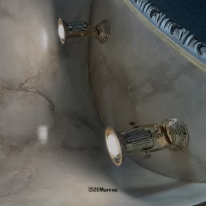
Mistake Nine: Ignoring the Installation Direction of the Wall Sconce
A common error is neglecting the installation direction, which affects shadows and light effects. Wall sconces direct light on the wall and space, unlike ceiling lights. Incorrect installation may result in:
-
Scattered or harsh light
-
Unpleasant shadows
-
Overly bright or dark wall areas
-
Disrupted spatial perception
-
Reduced decorative and functional effectiveness
Why Direction Matters
Wall sconces produce these main light types:
-
Up Light → toward ceiling and top of wall
-
Down Light → toward floor and bottom of wall
-
Up & Down → both directions
-
Spot → focused on a specific point
If installed incorrectly:
-
Up Light on a low ceiling → unpleasant shadows, cramped space
-
Down Light on stone or brick walls → harsh shadows, uneven lines
-
Up & Down on textured walls → irritating light lines
-
Spot → excessive bright spots, glare
Common project mistakes:
-
Up Light on low ceilings → space feels suffocating
-
Down Light on smooth white walls without considering angle → harsh light and unwanted shadows
-
Ignoring furniture placement → shadows fall on tables, beds, mirrors
-
Using spotlights for general lighting → insufficient, tiring light
Tips to avoid mistakes:
-
Test before installation — hold the light at intended height/direction
-
Consider ceiling height — low → Down or Diffused, high → Up or Up & Down
-
Consider wall texture and color — stone → soft, angled light
-
Consider room function — pathways → directional, bedrooms → soft, diffused
-
Use multiple sconces in large spaces for balanced lighting
Mistake Ten: Buying Wall Sconces Without Considering Build Quality and Safety Standards
A dangerous and common mistake is ignoring build quality, standards, and resistance to heat and moisture. Many focus only on appearance, ignoring technical and safety factors. Consequences:
-
Short lifespan, early LED or bulb failure
-
Excess heat, fire risk
-
Dust or moisture damage to internal circuits
-
Glare or uneven light due to low-quality optics/lenses
-
Non-compliance with electrical standards → shock hazard
Why Build Quality and Standards Matter
-
Body material:
-
Durable aluminum, brass, steel, or glass → long life, uniform light
-
Poor-quality plastic → cracks, color change, scattered light
-
-
LED/Bulb quality:
-
Branded LED → long life, stable light
-
Cheap LED → quick dimming, color shift, glare
-
-
Safety standards:
-
CE, RoHS, IP20–IP65 (for wet areas)
-
Ignoring standards → electrical hazards, early failure
-
Common project mistakes:
-
Buying cheap lights without IP rating for bathrooms/wet areas
-
Non-standard LED → color shift, early burn-out
-
Plastic sconces in hallways → cracks, fast discoloration
-
Ignoring proper wiring/terminals → weak and unsafe connections
Tips to avoid mistakes:
-
Check standards and certifications — IP, CE, RoHS
-
Choose reputable brands
-
Inspect body material and LED quality
-
Consider environment — wet → IP65, dry → IP20
-
Ensure proper installation and safety measures
Frequently Asked Questions (FAQ)
-
What is the best height to install a wall sconce?
-
Standard height: 150–170 cm from the floor, adjusted based on location and function (hallway, bedroom, living room).
-
How to choose appropriate light intensity?
-
Check lumens, not watts. Bedroom: 200–350 lm, hallway: 400–700 lm, living room: 300–500 lm.
-
Difference between watts and lumens?
-
Watt = power consumption, lumen = actual light output. Lumens are the main selection criterion.
-
Which light distribution suits different walls?
-
High ceiling → Up or Up & Down
-
Low ceiling → Down or Diffused
-
Textured wall → Diffused
-
Highlight artwork/sculptures → Spot
-
Does sconce color and material matter?
-
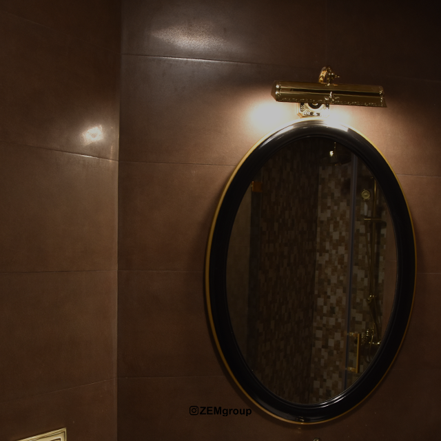
Yes, it should harmonize with décor, wall texture, and ambient light to avoid glare or disharmony.
-
Installing near a mirror — any tips?
-
Correct height and angle to provide soft, uniform light on the face and mirror without harsh shadows.
-
Can all wall sconces be installed in wet areas?
-
No. Bathrooms require appropriate IP rating (IP44 or higher).
-
How to avoid glare?
-
Choose proper intensity, distribution, and installation distance. Diffused or controlled-angle lights are best.
-
Installing near a TV — issues?
-
Direct or strong light causes reflection and glare. Use soft, angled lighting.
-
How to ensure quality?
-
Buy from reputable brands, check IP, CE, RoHS, LED quality, and metal/resistant body.
-
Can light intensity be dimmed?
-
Yes, dimmable sconces are ideal for bedrooms and living rooms.
-
Common mistake with Up & Down installation?
-
Sharp angles or small wall installation causes annoying shadows and light scattering.
-
Are all wall sconces suitable for luxury spaces?
-
No. Choose materials and designs that match the interior style. Cheap plastic lights do not create a luxurious look.

